In this short tutorial, I'm going to use chart.js to display the Premier League winners from 1992 to 2017.
Chart.js is an open-source javascript library for visualising data. It comes with many built-in responsive types of charts including Line, Bar, Pie and more. Chart.js comes with all the magic you need to create cool charts so there is often little need for any additional custom code when using it. Find out more about chart.js from the official site.
Using chart.js is very simple. You can follow the installation guide from this link if you're not familiar with it.
I'm starting with a basic index.html file like this:
<!DOCTYPE html>
<html lang="en">

<head>
  <title>Using charts.js for data visualisation</title>
  <meta charset="UTF-8">
  <script src="https://cdnjs.cloudflare.com/ajax/libs/Chart.js/2.5.0/Chart.min.js"></script>
</head>
<body>

</body>
</html>
I'm going to use a doughnut chart to represent the Premier League winners. For the record, only six teams have won the Premier League since its inception. Manchester United (13 titles), Chelsea (5), Arsenal (3), Manchester City (2), Blackburn Rovers (1), Leicester City (1).
Let's add the doughnut chart within the body tag with this code:
<canvas id="doughnut-chart"></canvas>
Now we can add the chart.js code just beneath the canvas:
<!-- DOUGHNUT CHART  -->
	<script>
		new Chart(document.getElementById("doughnut-chart"), {
		type: 'doughnut',
		data: {
			labels: ["Man Utd", "Chelsea", "Arsenal", "Man City", "Blackburn", "Leicester"],
			datasets: [
				{
					backgroundColor: ["#DC1F29", "#034694", "#EC0C1C", "#99C5E7","#3232FF","#1358A1"],
					data: [13,5,3,2,1,1]
				}
			]
		},
		options: {
			maintainAspectRatio: false,
			legend: { position: 'bottom'},
			title: {
				display: true,
				padding: 30,
				text: 'Premier League title winners from 1992-93 to 2016-17 season'
			},

		}
	});
	</script>
Let's see the result:
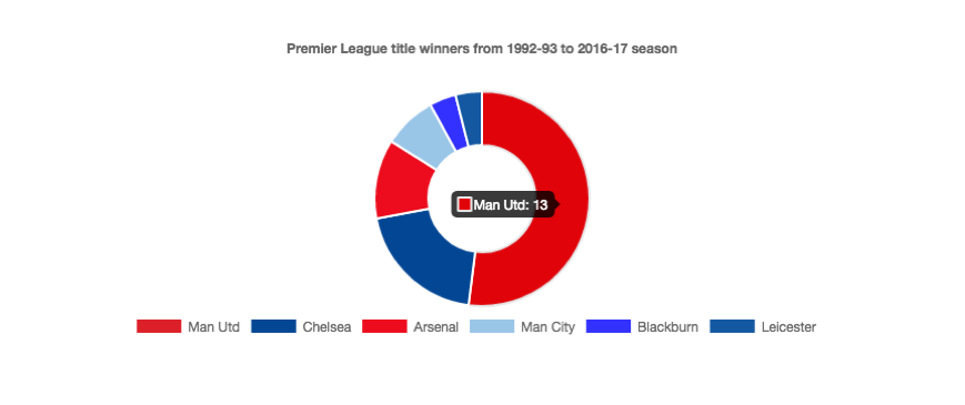
Aside from the fact that all Premier League title winners wear a Blue or Red kit (other teams might want to change colours), we can also see that Man United have won the most titles - 13 in total more than 50 percent from the 25 seasons played.
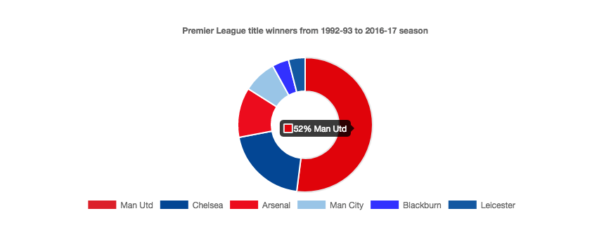
Suppose we wanted to display the percentage rather than the number of titles for each team. We'd simply add a tooltip configuration within the options. Then we define a dataset, the tooltip label and the total of titles(25). Lastly, we calculate the percentage by dividing the current value of the data array by 25 and multiplying it by 100.
tooltips: {
      callbacks: {
        label: function(tooltipItem, data) {
        	var dataset = data.datasets[tooltipItem.datasetIndex];
		    var tooltipLabel = data.labels[tooltipItem.index];
            var total = dataset.data.reduce(function(previousValue, currentValue, currentIndex, array) {
            return previousValue + currentValue;
          });
            var currentValue = dataset.data[tooltipItem.index];
            var precentage = Math.floor(((currentValue/total) * 100));
            return precentage + "%" + " " + tooltipLabel;
        }
      }
    }
Now reload the webpage and hover over the chart. It should display the percentage as shown below.